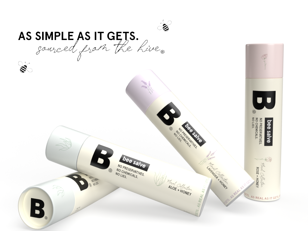
Burt’s Bees Re-Brand
For this project, I was tasked with creating a complete rebrand for any product I felt could benefit from a refreshed look and style. I chose Burt’s Bees and developed an elevated concept called B, a bougie yet natural bee salve brand. The design balances a more refined aesthetic with hand-illustrated elements to maintain the brand’s connection to nature.
Applications Used: Adobe Dimensions, Photoshop, Procreate, and Adobe Illustrator